www
If you just wanted to know my pick for the question above, here’s the link: AIO Launcher. The app is free and works on any Android smartphone running version 4.4 or later.
What’s the problem?
Imagine you’re taking the pilot’s seat in an airplane (or a simulator). In front of you is a massive instrument panel, but every display and switch is hidden under a cover labeled with the name and a brief description of what’s underneath. On day one, the instructor lays out the rules: each cover opens with a light touch, but when you open one, all the others close. It’s designed so you always know what’s where and don’t get lost in a sea of screens, switches, and levers.
In the first days of training, you’re grateful to the designers for creating such a beginner-friendly control scheme. But over time you realize it works against you. You’ve figured things out; you need to fly the aircraft, understand what’s happening, and have direct access to every control. So you ask the instructor to disable the auto-closing switch guards—or better yet, to remove them altogether.
But the instructor says that’s not possible, adding that all modern aircraft use exactly this kind of instrument panel—it’s the standard; and anyway, what do you even know about an interface designed by the brilliant Dronni Oyv?
I’m not equating airplanes with smartphones; I’m simply pointing out that for a system that generates huge amounts of information, the user should be able to see that information in place, not only after a finger tap. But that’s not how it is. Instead of the information, we’re told to look at “covers” (icons) that hide it.
Yes, Android has widgets, and if you sink a ton of time into it, you can find widgets that show whatever info you need… and end up with a patchwork screen, all over the place in style, color, and font sizes. Will it be convenient? No—I’ve tried; it’s a pain.
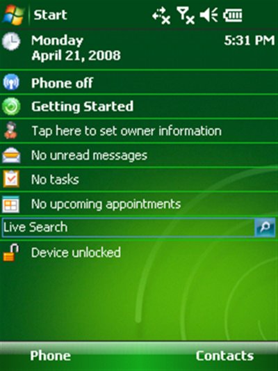
Many of us have already seen what a proper smartphone home screen should look like. It’s the “Today” screen in Windows Mobile. Yes, I don’t like that OS either and find it extremely awkward to use, but the WM home screen was a step in the right direction.
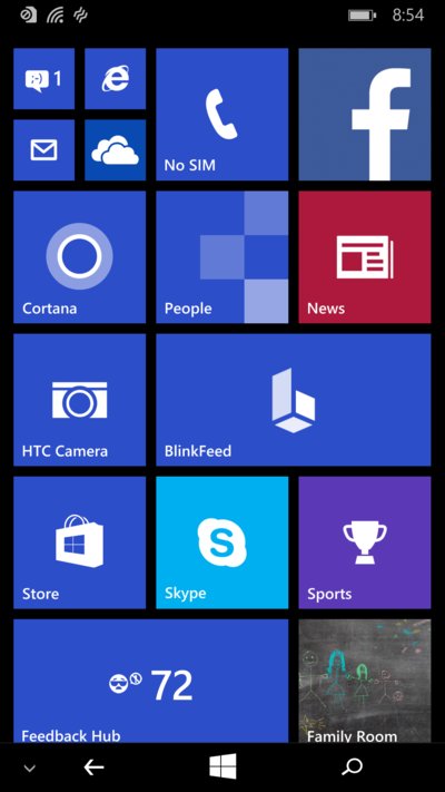
Later, on the Windows Phone home screen, Microsoft tried to do something similar in a more modern style. But the Live Tiles ended up more playful than informative: they took up too much space and often, instead of detailed information, showed just a number or a couple of words about an event.
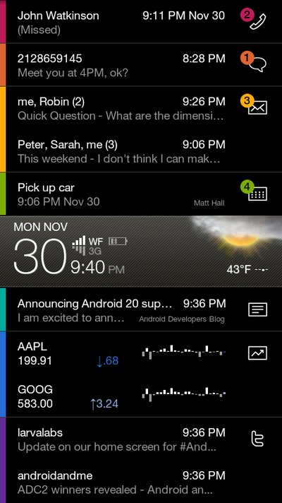
There was also SlideScreen, an insanely cool Android launcher from Larva Labs. Its home screen was almost entirely information: recent emails, Twitter and Facebook messages, missed calls, SMS, and even stock quotes. Larva Labs built it back in the Android 2.1 era, but it soon became clear there was no way to monetize an app like this: users didn’t get it and were unwilling to abandon the familiar icon-based interface.
Yahoo (Aviate), Microsoft (Microsoft Launcher), and indie developers (a good example: ASAP Launcher) all took a shot at it. None of them felt successful to me. Developers either hesitated to fully abandon the icons-on-the-home-screen paradigm, or they used the available screen real estate very inefficiently.
I got the idea to do it my own way.
Simplicity, Minimalism, Efficiency
Key ideas behind AIO Launcher:
1. To hell with icons. An icon grid is a colorful mosaic with zero informational value. What does the Skype icon look like? Personally, I picture some indistinct bright blue blob. And Dropbox? You can kind of make out the old box that’s been gone for ages, but the main thing is the dark blue, right? Then there’s Feedly — green, Sberbank — also green. Pocket — red, Yandex Taxi — yellow.
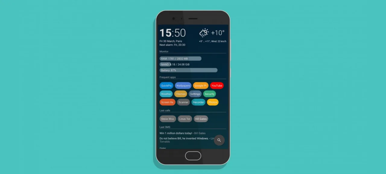
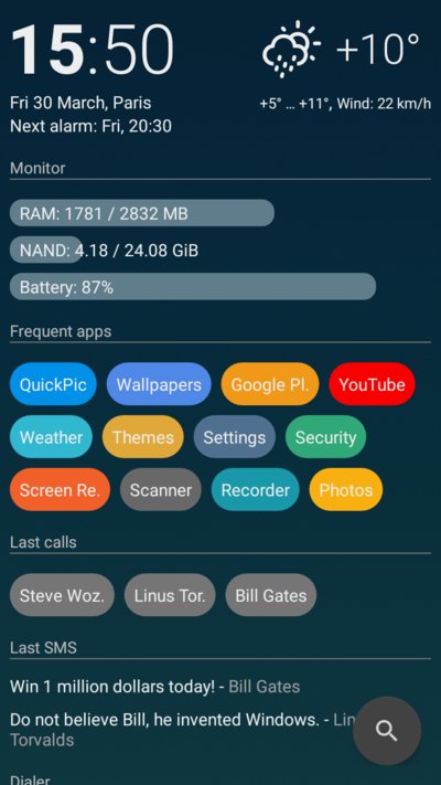
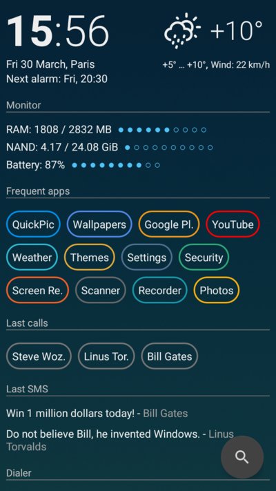
We don’t rely on icons; we rely on colors and names. Icons are just distracting noise—ideally, they shouldn’t be there at all. And by default, AIO Launcher doesn’t show them. Instead, it sorts apps by how often you launch them, so your screen always surfaces what you actually need—what you use most.
- What else should be on the screen? On the screen of a device called a “phone”? Obviously, your grandma’s call log — and the latest texts.
But we’re not talking about a plain phone—it’s a smartphone. So of course we’ll show the weather, email, news, tweets, Telegram messages, the calendar, and, naturally, the Bitcoin price. We’ll make it all just work with zero logins and end up with a capital‑S Smartphone. A smartphone that instantly shows all the info you need without you having to tap a thing. Isn’t that how it’s supposed to work?
AIO Launcher — it’s not a work of art and it’s not trying to compete with your Nova Launcher setup; it’s an app that simply makes using your smartphone more convenient.
 |
 |
 |
Conclusions
It’s strange that such an obvious, simple idea exists in so few implementations. It’s strange to see people “stripping” their smartphones down so only the wallpaper shows. It’s strange that I had to write AIO Launcher myself instead of just using something ready-made.